

You hold another greige token against the living room wall, and it seems perfectly safe. But next to the parquet floor, it also seems strangely lifeless. Color predictions for 2027 point to a richer place.
The chip that is finally exchanged
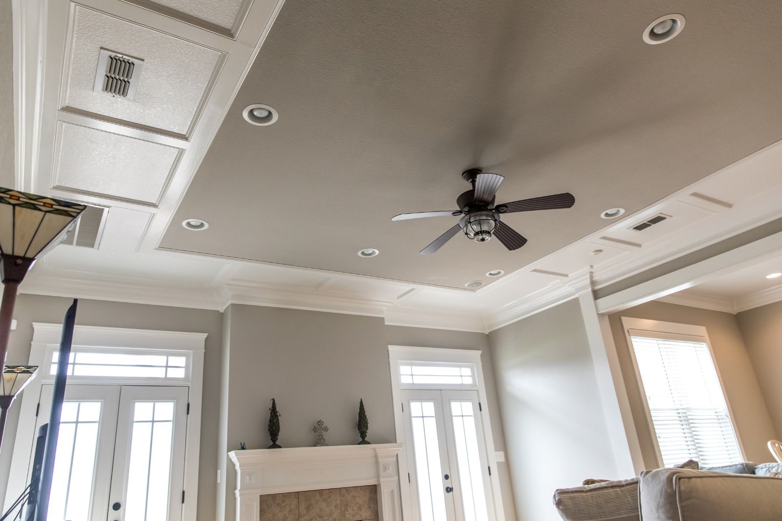
That richer neutral is green, especially muted olive, herbaceous, and heritage shades. The kitchen designers surveyed for 2027 put green in 83% of their projected palettes.
The same shift is seen in the year’s paint forecasts, from pale celery to mossy olive to deeper traditional green. These shades bring color to a room without requiring a new sofa, a new rug, or a new row of cabinets.
The secret is underneath. Brown or gray undertones soften its intensity, so a mossy olive recedes a bit like greige does. You get true colors and the room maintains its calm backdrop.
Why is the wall different at dinner?
Paint color is simply the light bouncing off your eyes. The green pigment modifies the part of this light returned, and the gray or brown shades soften the result.
That’s why the lampshade you loved at noon may be different once the lamps are turned on. Warm evening bulbs give off olive and yellow notes. Cooler daylight can bring out blues or grays. The deeper the green, the greater these changes.
The green needs to meet the room itself and it needs a little time.
Two days with three boards
Put down the chip and choose three real samples: a pale grassy green, an earthy olive, and a deeper forest hue. A screen can help you fine-tune things, but the real paint is your choice.
Apply two coats of each to its own 24-inch square foam board, leaving a 2-inch white border. Once they are dry, place them next to the floor, sofa, counter and woodwork. Then leave them outside for 48 hours and check them around 8 a.m., at noon, and again after the lamps are turned on. Anything that turns muddy, neon, or surprisingly blue is excluded.
This takes more time than holding a chip against the wall. But it shows you how color behaves during an ordinary day.
What your oak floor already knows
While the boards are there, the room gives you clues. Olive greens tend to sit comfortably next to warm oak, aged brass, cream upholstery and clay-colored textiles. Blue-greens make more sense with cooler marble, stainless steel and gray floors.
Not ready for a fully green wall? Try it on cabinets, built-ins, or the wall above the wainscoting. For a visual reference, see how deep green changed a hallway.
Once you’ve chosen your shade, repeat it in two smaller places, perhaps on a cushion and a piece of art. This echo gives the wall an intentional look. And if your green is deep, keep a few pale surfaces nearby so the room still has contrast after the sun goes down.
Where greige still wins its place
Before opening the can, follow its instructions regarding ventilation, protective equipment, temperature and recovery time. Paint won’t repair damp, peeling, or damaged walls, so treat those first.
If each plank clashes with your floor, keep the greige and bring in some green through fabric or furniture.
Gn entert